

Whole Foods Market Mobile App Redesign Project
Background
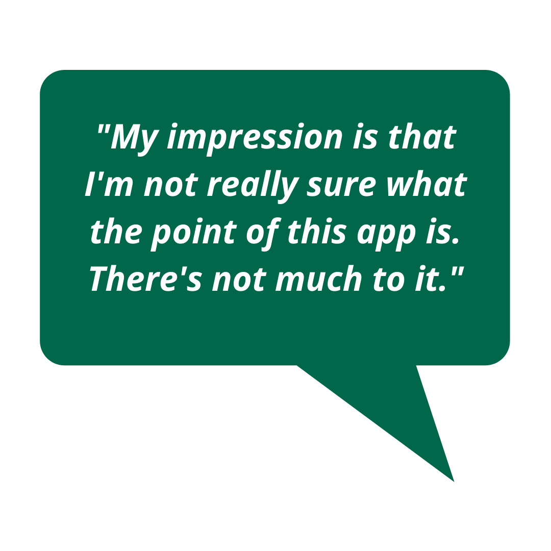
Whole Foods Market’s mobile app currently has 2.2 out of 5 stars on the App Store and negative reviews left by users express frustration with its lack of desired features. With this app users are unable to efficiently shop the store, make shopping lists, place orders, or search for available items.
This project will research shopper expectations for the grocery shopping app, which will inform design updates for a mockup of a new and improved Whole Foods app.
GOAL: Enhance both the UX and features of the app to inspire shoppers to download and use the app to reach their goals.
MY ROLE: Manage and lead project from start to finish.
Research
For this project, I conducted both primary and secondary research to capture the current state of how users experience the app.
Primary Research
I recruited 6 participants based on their shopping habits and familiarity with mobile apps. They were regular Whole Foods shoppers and smartphone users. Each participant was asked a series of questions while I recorded their answers.

Interview Questions
Tell me about your experiences shopping at Whole Foods.
Do you have any experience purchasing groceries online? If so, tell me about your experience. If not, is it something you’ve considered? Why or why not?
Have you used the Whole Foods app before? If so, tell me about your experience.
Have you used other grocery shopping apps? If so, which ones? What did you like about them? What did you dislike?
Is there anything else about your experience shopping at Whole Foods that you would like to share?
Usability Test
Cognitive Walkthrough
Each participant navigated the app while talking out loud as they did so.
Follow-up Questions
What is missing from this app that you wish it had? What features would motivate you to use it?
Was there something you expected to find in this app that you didn’t?
What do you think this app does well, if anything?
Was anything frustrating while using this app? If so, please explain.

Findings
Only a couple participants had experience using the Whole Foods app. Several had used other grocery shopping apps in the past, mainly to load coupons to their accounts and find sales.
All participants found that the Whole Foods app lacked many features that they would have expected to find in a grocery shopping app.
Pain Points:
Lack of organization
Lack of features, limited functionality
No cart or way to shop
No Search bar or filter feature
No way to make a shopping list
Only shows sale items, not all available items
No reviews
Tapping photos of food in the app does not provide more information
No way to order groceries for pickup
Secondary Research
In addition to talking to real shoppers, I wanted to utilize user feedback that already existed as reviews on the app store. I focused on 1 and 2 star reviews to understand the most frustrating experiences. Here are the most common pain points noted:
No way to track past purchases or receipts
Sales items are not organized by category so users are forced to scroll through ALL items
No way to create shopping lists or organize them by aisle
No way to shop the store to place orders for pickup/delivery
Confusing product images and descriptions
Define
Using the findings from the interviews and usability tests, I created a shopper persona that capture the target audience.
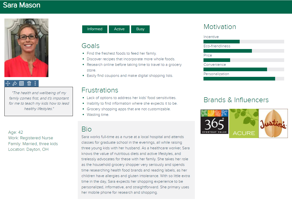
Redefining Project Goals
Prioritize design updates based on the most common desired features discovered during initial research.
Define workflows and how they will satisfy consumer expectations with efficiency, intuitiveness, and effectiveness
Identify how the app wireframe should be organized to help users navigate more successfully
Build a high-fidelity mockup based on these insights.
Ideate
Referencing the user persona and research findings, I mapped user task flows and site wireframes prioritizing user needs that showed up in both Primary and Secondary Research. Users most commonly expressed the need to browse savings efficiently, view past orders, shop for groceries and place orders online, and create shopping lists.
Task Flows

Sitemap

The task flows and sitemap helped me refine my ideas and create sketches for a paper prototype with initial designs for the app update.

Test
Usability Test: Paper Prototype
Using this paper prototype, a usability test was conducted with 3 participants who were asked to complete a series of tasks. The test asked participants to think out loud as they used the prototype, which helped provide insight into what they were trying to accomplish, what they were thinking or what might have been confusing them.
Tasks
Do you have an Amazon account?
Yes → Sign in with your Amazon account
No → Create a Whole Foods account
Browse the in-store savings for your local Whole Foods.
You recently ordered a new brand of cereal from the Whole Foods app that you really liked, but you can’t remember the brand. Go to your recent orders to find out.
You would like to order a few quick groceries from Whole Foods. You want to buy 3 avocados. Find these and add them to your cart.
Let’s say you’re planning a birthday party and want to create a shopping list in the Whole Foods app. Create a new shopping list titled “Birthday Party.”
Findings
While most tasks were completed by the participants quickly, there were a few spots in the usability test where they had difficulty:
For those participants who were Amazon Prime members, the Prime Code icon in the persistent footer was not a quick get and they were unable to locate the Prime Code.
To find recent orders, one participant started with the Lists icon, then clicked the Savings icon, then the Prime Code icon. They then found the Orders icon in the footer, completing the task from there.
All 3 participants had the most difficulty with the final task, which was to create a new shopping list. Each started by navigating to the Lists icon, but from there were unsure how to proceed to create a new list.
Prototype Updates
Label the footer icons with text

Updated Persistent footer. Text was added to clarify each footer icon.
2. On the Lists page, instead of leading the user to another subpage to complete the task, I removed the Manage Lists section and kept all lists grouped on a single page. Then I updated the View All Lists Button to “+” in a prominent area at the top of the Lists landing page and labeled with text to create a new list.

Original Design

Updated Design
Conclusion
The design updates outlined in the above sections are meant to create a more well-rounded shopping experience for potential users. They would allow shoppers to search products, create shopping lists, view savings, and place orders. These updates would create a more navigable, appealing, information-driven experience, which would give the app more potential downloads and encourage Whole Foods shoppers to use the app more often.
*I am in no way affiliated with Whole Foods Market.