

ACCO Brands Website Usability Study
Background
ACCO Brands is one of the largest producers of branded academic and business products. ACCO’s Direct-to-Consumer website saw little traffic, high bounce rates, and a large volume of abandoned shopping carts. As the D2C team began initial plans to revamp the site, I was tasked with researching the user experience to inform strategy.
GOAL: Discover how consumers want to shop online for school and office supplies and how to improve their experience on ACCO’s D2C site
MY ROLE: Manage and lead project from start to finish.
Recruitment
A screener was shared via social media platforms and individuals who met the target audience requirements were contacted directly to participate in the study. Ten participants completed both an interview and a usability test.
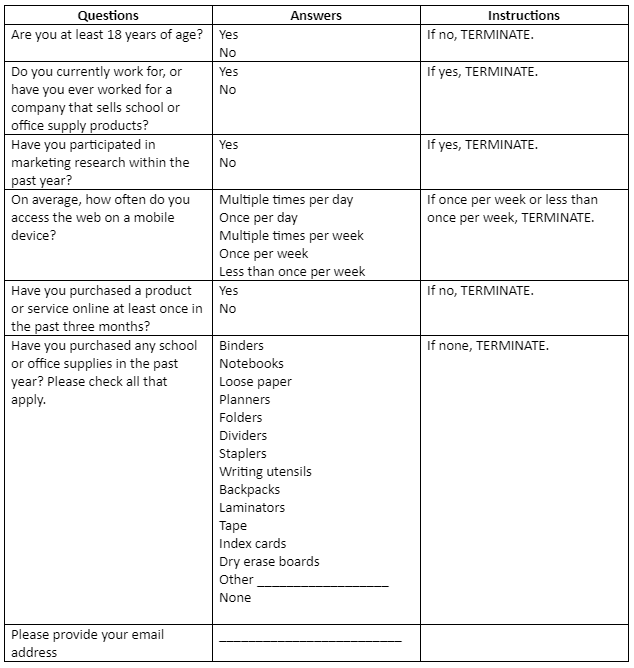
Recruitment Screener
Research Methods
Interviews
The floor was open for participants to discuss their experiences with online shopping, information they look for on ecommerce websites, and their impressions of ACCO’s D2C website.
Usability Test
Participants used the site to complete assigned tasks. The usability test asked participants to think aloud as they used the site, which helped provide insight into what they were trying to accomplish, what they were thinking or where they experienced confusion. Users worked through a series of tasks including navigating the homepage, finding a specific product to purchase, locating information on that product, and checking out. They also completed similar tasks on other ecommerce websites for competitive analysis.
Data Analysis
Interviews captured user values, goals, experiences, likes, dislikes, pain points, and influencers of purchase decisions while the usability test revealed observed processes, activities, and behaviors.
Qualitative data collected from the usability tests include how users:
navigate the homepage
find a product using categories/departments
browse through the category for the product desired
find information about the product
find a product using the search function
purchase a product
The following snapshot is a visual representation of the key takeaways from the data gathered from both interviews and the usability tests:

Online Shopping Likes show what provided a high quality user experience while Pain Points revealed what led to negative experiences. Information Needed includes details that consumers like to see before they make a purchase decision. Attractive Language includes phrases and wording that stood out to the users and motivated clicks. ACCO Site Audit are points of feedback provided by users as they browsed ACCO’s D2C website.
Findings
Key Takeaways:
Users typically have positive experiences when they can save time and take shortcuts while shopping online. This includes suggested products based on past purchases, price comparisons, speedy search functions and saved credit card information. When users can skip a step or move faster through the process…They like to see photos, videos and diagrams rather than big chunks of text to read. If a site makes suggestions based on past purchases or compares prices and products, that eliminates shopper research steps. Rather than browsing through categories or departments, they prefer to simply use search functions to find products. If a website saves their credit card information, they don’t have to spend time entering it multiple times.
Interruptions to the user journey led to the most negative feelings when. Pain points discovered in the research included ads, pop-up surveys, being forced to “Sign up,” slow site speed, and ineffective search function. Online shoppers use the search function frequently, so they expect to find relevant results quickly. When a search yields results that the user was not looking for, this leads to frustration.
One of the biggest challenges with online shopping is that shoppers cannot physically look over a product they are interested in buying before they make the purchase. Customer reviews were found to be extremely important to purchase decisions because shoppers trust feedback from their fellow consumers who HAVE physically reviewed the product.
The phrase “free shipping” was found to be most enticing to shoppers. Nearly every participant in this study cited paying for shipping as the biggest annoyance when shopping online. School and office supplies are typically lower price point items, so it’s easier to buy them in-store rather than waiting for them to be shipped and it’s difficult to justify paying for shipping. Several participants mentioned that they probably would not shop on ACCO’s site when they can find the same product on Amazon for a cheaper price with free shipping.

The results of the research showed that the site did provide a positive user experience in some areas, but there were other points along the user journey that caused confusion and frustration.
Recommendations
Update and Reorganize the Website
The following recommendations came from direct user feedback of the ACCO Brands website:
Continue to include large images showcasing all product features and angles. High-quality images of all features with zoom-in capability will help the potential buyer to better visualize the product.
Eliminate the Pros + Cons on product pages. They are confusing and unhelpful to users. Additionally, we would never want to suggest that there are any reasons a shopper would not want to buy our product. 😊
Utilize online only discounts and free shipping. Participants said that these might motivate use of the site.
Remove social sharing buttons from the homepage since shoppers most often will not share the homepage via social media.
Avoid immediate pop-ups on the homepage that interrupt users.
Enhance the search function. This feature is heavily used by shoppers so it should perform quickly and accurately. It should do a better job with popular keywords. For example: “floral planner.” Ensure that searches provide relevant results.
Details should be more concise on product pages. Bullet main features and benefits above the fold, then add more details underneath.
Usability Tests for Specific Product Categories
Throughout this study, participants commented on what information they wished they could see for a particular product. For example, a participant looking for a planner wished to know exactly what the pages looked like, whether it was a weekly or monthly planner, etc. I recommend separate interviews and usability tests based on product categories, such as planners, backpacks, shredders, whiteboards, etc. to determine how users like to shop for these items specifically.
Online-Only Incentives
In order to compete with Amazon’s lower prices and free shipping, I recommend promoting online-only deals for a percentage off total cost plus free shipping when a user completes a task, whether that be spending $50, completing a survey, or leaving a review. Since reviews are considered important in influencing customer purchase decisions, enticing users to leave reviews on products they’ve purchased would add value.
Cross-Selling and Bundling
Cross-selling will benefit both ACCO’s ecommerce business and the consumer shopping experience. Proposing complementary or similar products to the one(s) the customer has already found will eliminate the need for them to take the time to look for more products. These suggestions should be displayed on the product page underneath the main product, similar to the “Frequently Bought Together” sections used by Amazon.com.
Bundling brings together related products that are relevant to a customer. Buying them individually involves more decision making and more steps whereas through bundling, a shopper is able to buy multiple products together at the same time. Therefore when a shopper looks at article A, we should propose a logical bundle, A+B+C, making the shopping experience easier by packaging all three items and selling them at a price lower than the sum of the individual parts. Every action the user has to take makes decision making more complex, so by eliminating the need to search for A, B, and C individually, we will ease the shopping process and eliminate friction.
Some more cross-selling tips:
A recommended product will likely sell better if it does not exceed the total cart by more than 25%. For example, if the original order is $40, cross-selling shouldn’t exceed $50.
Use cross-sell techniques on the checkout page to tap into impulse buying.
The ability to make a decision reduces as the number of choices increases, so avoid bombarding shoppers with too many choices when cross-selling.
If shoppers have already declined a suggested product, don’t push it. A customer’s experience may turn negative if they feel pressured.
Conclusion
The findings and recommendations concluded from this research will assist ACCO in capitalizing on the opportunity to create a strong D2C website that prioritizes the shopper experience. User research is fundamental for positive customer experiences, and positive customer experiences have proved to have significant business value.
Discovering the answers to our research questions by working directly with target users will allow us to better understand the goals users want to accomplish, what they need to do in order to reach those goals, and how ACCO’s site can help.